
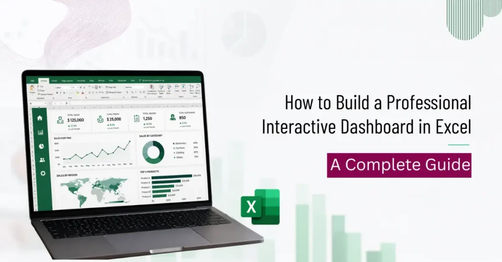

An interactive dashboard in Excel brings large amounts of data into one clear, visual report that updates as filters change. Instead of scrolling through rows of raw numbers, a manager or team can view sales figures, expenses, or performance metrics at a glance and look closer at the details that matter most to their reporting cycle.
Building a professional Excel dashboard does not require programming knowledge. With the right planning and a few core Excel features, anyone comfortable with basic spreadsheets can put together a dashboard that looks polished and works well across departments, from finance to operations. This guide covers how to plan, design, build, and refine an interactive dashboard in Excel from the ground up, including the exact tools, formulas, and design habits that separate a usable dashboard from a cluttered one.
What Is an Interactive Dashboard in Excel?
An interactive dashboard is a single Excel sheet that pulls together charts, tables, and summary figures and lets the person viewing it change what is shown using filters, dropdown lists, or slicers. It differs from a regular spreadsheet in one key way. A spreadsheet displays raw data, while a dashboard summarizes and shows that data visually so patterns are easy to spot without scanning hundreds of rows manually.
Because the layout is visual first, a well-built dashboard can communicate a full month of performance in the time it takes to read a single page, which is the main reason teams move away from static spreadsheets once their reporting needs grow.
Common uses for Excel dashboards include:
- Sales reporting
- HR analytics
- Marketing performance tracking
- Financial reporting
- Project management
- Inventory tracking
Benefits of Creating an Interactive Dashboard in Excel
A dashboard built with care supports faster decisions because the information is already organized and easy to read. Reports that once took hours to compile can be refreshed in seconds once the structure is in place. Filtering by department, region, or date range happens right away, and the same file can serve as one central report instead of several separate spreadsheets scattered across a team.
Key benefits:
- Faster, clearer decision making
- Easy data visualization
- Reduced reporting time
- Instant filtering across departments, regions, or time periods
- A polished, professional presentation for stakeholders
- One central report instead of many disconnected files
How Long Does It Take to Get Comfortable Building Excel Dashboards
The learning curve depends on existing Excel familiarity: someone already comfortable with basic formulas and Excel Tables usually picks up PivotTables and slicers within a few focused sessions, while a complete beginner needs more time first on data cleaning and basic formulas before dashboard-specific tools make sense. The tools themselves are rarely the slow part since slicers and PivotTables are straightforward once demonstrated. The slower part is layout and design judgment, knowing which chart fits which data and where a KPI row should sit so it gets noticed first, and that judgment builds faster with feedback on an actual dashboard rather than trial and error alone, which is where a guided course such as WSQ Create Interactive Dashboard in Excel shortens the timeline.
Essential Excel Features Used in Interactive Dashboards
A handful of Excel tools form the backbone of most dashboards, and each one plays a distinct role in how the final report looks and behaves.
Excel tables keep raw data structured and easy to reference as it grows, since new rows are automatically included in any formula or chart built on top of the table. PivotTables summarize large datasets quickly, turning thousands of rows into a compact summary by category, region, or time period. Pivot charts then turn that PivotTable data into visuals that update automatically whenever the underlying summary changes.
Slicers let viewers filter data with a single click without needing to understand how the formulas or PivotTables behind the dashboard actually work. Timelines do the same job specifically for date ranges, making it simple to compare one quarter against another. Named ranges make formulas easier to read and maintain, especially in dashboards with many interconnected calculations.
Conditional formatting highlights important values automatically, such as figures that fall below target or expenses that exceed budget. Data Validation Dropdown Lists control what a user can select, which keeps input consistent and prevents formula errors caused by unexpected entries. Sparklines show small trend lines inside a single cell, giving a quick visual of movement over time without taking up chart space.
The calculations behind most dashboards rely on a small set of formulas: SUMIFS, COUNTIFS, XLOOKUP, INDEX MATCH, FILTER, and UNIQUE. Together, these handle everything from conditional totals to dynamic lookups that update as new data is added.
Plan Your Dashboard Before You Start
Start by defining the goal. Sales analysis, budget tracking, and employee performance each call for a different structure, so the end use should guide every decision that follows. Next, identify the audience. Managers, business owners, finance teams, and HR teams will each need a different level of detail, and building for the wrong audience is one of the most common reasons a dashboard goes unused.
Select the KPIs that actually matter for the goal, such as revenue, profit, expenses, customer growth, conversion rate, or target achievement. Finally, organize the data first. Remove duplicates, handle missing values, standardize formats, and convert data ranges into Excel tables before building anything visual, since a dashboard built on messy data will only display the mess more clearly.
Step-by-Step Guide to Building an Interactive Dashboard in Excel
Step 1: Prepare and Clean Your Data Remove blank rows, standardize date formats, correct number formatting, check for duplicates, and convert the range into an Excel Table.
Step 2: Create PivotTables Insert PivotTables to group and summarize the cleaned data. Multiple PivotTables can feed different parts of the same dashboard, each drawing from the same clean source.
Step 3: Build Pivot Charts Choose the chart type based on what the data needs to show. Column and bar charts work well for comparisons, line charts suit trends over time, combo charts handle mixed data types, and pie charts should be used only when there are a few categories to compare.
Step 4: Add Slicers and Timelines Slicers for department, region, or product, along with timelines for date ranges, let viewers filter the dashboard without touching the underlying data.
Step 5: Create KPI Cards Simple, clearly formatted cells showing figures like total sales, total orders, profit, or average order value give viewers an instant summary before they look at the charts in detail.
Step 6: Design the Dashboard Layout A clear layout usually includes a header, a KPI row, a charts section, a filters section, and supporting tables, arranged so the most important information is visible first. Readers who want a guided, classroom-based walkthrough of this stage can refer to the Excel dashboard course, which covers layout and design in depth.
Step 7: Apply Professional Formatting Consistent colors, a clear font hierarchy, proper alignment, enough white space, and correct number formatting make the difference between a dashboard that looks finished and one that looks unfinished.
Step 8: Test Dashboard Interactivity Before sharing the file, test every slicer, refresh all PivotTables, check formulas, and confirm that charts update correctly when filters change.
Best Dashboard Design Practices and Tips for More Interactivity
Keep the layout simple and avoid unnecessary charts. Highlight the KPIs that matter most, use consistent colors throughout, and put readability ahead of decoration. A dashboard that is easy to print and easy to move through tends to get used more often than one that looks impressive but is hard to follow during a live meeting.
To add more interactivity, charts that respond to filters, additional slicers, dropdown menus, and conditional formatting all help, along with titles that update based on the selected filter and automatic data refresh where the source data allows it. A dashboard that reacts visibly to a filter change also builds more trust with viewers, since they can see the numbers respond in real time rather than taking the report at face value.
For a guided, practical approach to these techniques, structured Excel dashboard training walks through building and refining a dashboard step by step, with feedback along the way.
Common Mistakes to Avoid
Most dashboard problems come from a few repeated habits, not the tools themselves. These are easy to fix once spotted, but easy to miss under time pressure.
- Too many charts crowded onto one screen
- Inconsistent formatting across sections
- Wrong chart type for the data being shown
- Skipping the data cleaning step before building
- Overly complex formulas that are hard to maintain
- Forgetting to refresh data before sharing the file
Questions Readers Often Have
A dashboard that stops updating is usually not connected properly to the source range, or a PivotTable simply needs a manual refresh. Building an interactive dashboard does not require VBA or macros. PivotTables, Slicers, and standard formulas are enough for most business reporting needs. If a dashboard looks cluttered even when the underlying data is clean, the issue is almost always the layout rather than the numbers themselves, and reducing the number of charts while adding more white space usually fixes it. Excel remains a practical choice for small to medium datasets, and larger, more complex datasets are where a dedicated business intelligence tool becomes worth considering.
Conclusion
Building an interactive dashboard in Excel starts with well organized data and a clear goal. Excel’s own features, including PivotTables, Pivot Charts, Slicers, and a handful of formulas, are enough to create a professional report without additional software. Good design choices, more than technical complexity, are what make a dashboard usable day to day. Once the basics are in place, the same process can be adapted to specific reporting needs. A sales dashboard for tracking revenue and targets, a financial dashboard for expense and profit reporting, or an HR dashboard for headcount and attendance each follow the same core steps covered here, adjusted for the metrics that matter most to that function.