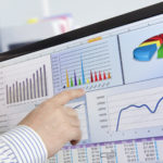

With Microsoft Excel, you can create dashboards which contain summarized graphs, charts and maps. dashboards are an overview of data located in a single place that are usually prepared for managers and decision makers. Advantages of dashboards include allowing managers and decision makers to relate to the data and be able to spot if a certain segment of the business is not performing well.
Do’s:
- Do design the dashboard with the end user in mind
By designing the dashboard with the end user in mind, you need to make sure that the dashboard is comprehensible and user-friendly for the end user. For example, if a dashboard is designed for the marketing manager, unnecessary information such as amount of IT budget used for the month should be removed from the dashboard. Below are a few Do’s and Don’ts of Excel Dashboard Design Practices. Additionally, the dashboard should not contain technical jargon which the user does not understand.
- Do focus on Functionality over Design
You should focus on functionality over design as dashboards are supposed to firstly provide vital information about a business, then secondly be aesthetically pleasing. To improve on the functionality of a dashboard, designers should be focusing on how to increase users’ productivity and efficiency and cut down time spent on mundane tasks.
- Design Consistency and Simplistic design
As always, design consistency is crucial. Design Consistency means that your fonts, line breaks, styles, labels, colour schemes and navigation buttons are all the same. If your dashboard is not visually consistent, your dashboard will look disorderly and confusing to the user. For dashboard design, simplistic design is the most beautiful as it enables the end user ease of use and ease of understanding.
Don’ts:
- Don’t use too many colours in the dashboard
Using too many colours in the dashboard makes it look messy and unprofessional. You should try to avoid using too many colours unless you are trying to highlight important information. You can use natural colour tones for less important information for example the graph axis. Also take note not to misuse certain colours like red and green as most people relate to these two colours as representation of stop and go respectively.
- Don’t use 3-Dimensional graphs to present your data
The majority of the data shown in a dashboard is either 1-dimensional or 2-dimensional, having a graph that displays 3 dimensions is counter intuitive to the design.
In most cases, the third dimension of a 3-Dimensional graph provides no additional functionality, it only is aesthetical.
- Don’t use Radar Graphs to present your data
Radar graphs help users to understand the data through the combination of data into a certain shape. However, there are numerous disadvantages to using radar graphs in your dashboard, including an increased difficulty in comparing data, some data values will be unintentionally hidden from view, and the radar graph being overly focused on large values. As such, radar graphs are not suitable to be used in dashboard design.